General Consortium Takeover - News and Rumours

Status
Not open for further replies.
I quite like a Oxford skyline silhouette as a background. Not sure that version is the best that could be designed, but I’d imagine that would be highly attractive to our new owners in terms of brand association with the city.
Joking apart it would be good to connect the club more with the city centre and university, which are what Oxford is famous for. The club has always been seen as a thing apart.
 
There's a difference between looking at the images that link the club to the city, and changing the official club badge.
 
I quite like a Oxford skyline silhouette as a background. Not sure that version is the best that could be designed, but I’d imagine that would be highly attractive to our new owners in terms of brand association with the city.
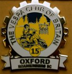
its not easy or straightforward to incorporate the city skyline into a badge .... Oxford Roadrunners SC ( cog/branch 15 of Vespa Club of Britain) large metal cog 'badge' that's been around for a few years now ( for example) ....


ORRSC cog 15 large metal badge.jpg


and yes its slightly out of focus the above pic! ^^

the original design scan (below) is a bit more of a clearer image....

0.jpg
 
In terms of graphic design composition the skyline badge is a horrible mess with clashing points of tension between the Ox's horns and the pointy spire. It's a great idea but that particular effort does not work.
 
its not easy or straightforward to incorporate the city skyline into a badge .... Oxford Roadrunners SC ( cog/branch 15 of Vespa Club of Britain) large metal cog 'badge' that's been around for a few years now ( for example) ....


View attachment 7109


and yes its slightly out of focus the above pic! ^^

the original design scan (below) is a bit more of a clearer image....

View attachment 7110
Agree completely. The linearity and beautiful simplicity of the ox head makes introducing an irregular pattern behind it really difficult.

I was thinking the other day about notts forest-esque set of wavy lines to represent the Thames with a single silhouette of something like the Radcliffe camera. I’m certainly no designer though, but I’m sure that there’s a few good options that a proper design team could come up with.
 
its not easy or straightforward to incorporate the city skyline into a badge .... Oxford Roadrunners SC ( cog/branch 15 of Vespa Club of Britain) large metal cog 'badge' that's been around for a few years now ( for example) ....


View attachment 7109


and yes its slightly out of focus the above pic! ^^

the original design scan (below) is a bit more of a clearer image....

View attachment 7110
Who cares about a few hairdryer riders
 
If we were ever to leave the Desmond Morris' Minoan Ox behind,

Brilliant example of why we shouldn't.

Desmond Morris was a proper thinking man the like of which will be sadly missed. Is already missed.

The Minoan Ox has a purity of line and clarity, referencing a preeminent civilisation to which we can aspire as supporters in our dress, behaviour and progressive attitude, not to mention table manners.
 
Status
Not open for further replies.
Back
Top Bottom