General Would you welcome a more traditional OUFC logo/badge?

Would you welcome a more traditional OUFC logo/badge?


  • Total voters
    62
  • Poll closed .

Northstandboy

Owner
Staff member
Joined
5 Dec 2017
Messages
8,605
*TOTAL SPECULATION*

With the clubs cryptic Tweets, would you welcome a more traditional Oxford badge/logo for the club?

It would suite the "Oxford brand" that Tiger kept talking about.

The image of the Tweet in question:
1687265205258.png

Vote and comment, poll closes in 4 days.
 
Last edited:
With the clubs cryptic Tweets, would you welcome a more traditional Oxford badge/logo for the club?

It would suite the "Oxford brand" that Tiger kept talking about.

The image of the Tweet in question:
View attachment 14175

Vote and comment, poll closes in 4 days.
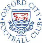
Hope not, it looks too similar to the Ox over the water in Oxford city's badge.

oxford-city-fc-logo-AC471DFA0F-seeklogo.com.png
 
I have great affection for the old badge. But the Desmond Morris Minoan Ox head has now become pretty iconic. I wouldn't want to change back particularly.
Precisely. In fact I would argue that Morris' OUFC badge is every bit an icon of Oxford as a whole, as any other form of Ox-related symbolism. It is both something that binds the club to Oxford and gives it a unique identity.

In any case, I reckon this is all barking up the wrong tree becasue these OUFC/Oxford-related icons that are currently being teased by the club are probably all part of the kit launch and you will see them appearing in their own right on various kit versions

London Road Arch as yellow "stripes" on the sides of the shorts anyone?
 
The Ox head please but matching the kit colours….
 
The Minoan ox head is the traditional club crest to most of us now? Madness to change something so distinctive to something so bland and run of the mill
 
No. Absolutely NOT. And I would hope the owners don't even consider changing the badge without extensive discussions with the fanbase.
 
Not a chance. The ‘ain’t broke’ argument can get in the bin too. It’s not that it ‘ain’t broke’, if anything it absolutely excels at its job of being a first class symbol of our football club. I’d like to think the board/owners/whoever would consult the fanbase on this before doing it. I think this whole thing will be about the kit anyway.
 
I normally only buy the shorts for the gym, a mug and a calendar (worst thing to buy, this month has the Portsmouth manager 😂), but I will not be buying any of that if the badge has been changed to the pile is s**t above.
 
Although I don't want rid of the Minoan Ox, I'm still not the biggest fan of our current crest. I'm not too fond of the shield shape, the pin stripes, or the way the font is larger for the 'Oxford' than the 'United'. Personally I'd prefer either the ox head alone as we've had previously, or in a crest but with the ford/water somehow in there too.
 
Nope. The Desmond Morris Minoan Ox circa 1980 for me, which the current crest featured since 2018 is a poor imitation. The Minoan Ox is as iconic as Forest, Derby or Wolves. I can understand why the club may want to appeal to their home countries, but first and foremost our core supporters should be considered first. Otherwise, we risk scoring an own goal, in the same way Cardiff did when they went red.
 
Although I don't want rid of the Minoan Ox, I'm still not the biggest fan of our current crest. I'm not too fond of the shield shape, the pin stripes, or the way the font is larger for the 'Oxford' than the 'United'. Personally I'd prefer either the ox head alone as we've had previously, or in a crest but with the ford/water somehow in there too.
I do agree that just the Ox head is better rather than with all the extra stuff.
 
LOL all this discussion of the back of 2 random tweets from the club featuring primary school art level images.

Changing the badge to the cow having a paddle in the river won't be any more meaningful to foreigners than our current badge.
 
Back
Top Bottom