battman
Well-known member
- Joined
- 10 Dec 2017
- Messages
- 2,259
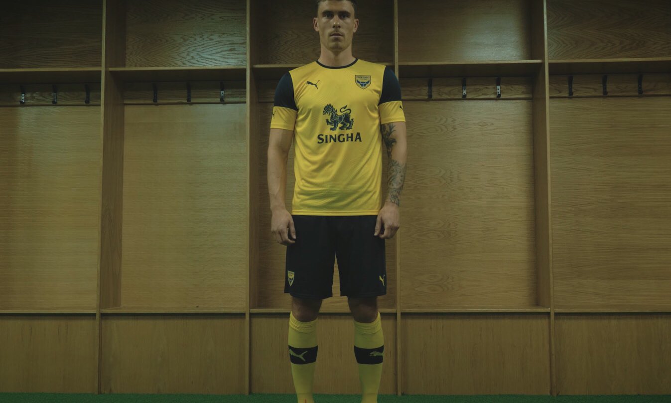
Have a feeling we'll be greeted with new kits tomorrow morning.
Can you predict all of our transfers now please?

Have a feeling we'll be greeted with new kits tomorrow morning.
And when do they start construction work on the new stadium ?Can you predict all of our transfers now please?
Theres been worse , theres also been much better too.hmmmmm
The club hasn't produced long-sleeved kits since 08/09 (though admittedly some players have chosen to wear long-sleeved lycra tops underneath their shirts in the colder months).Theres been worse , theres also been much better too.
Positives:- blue shorts & mainly yellow socks
Negatives:- neck looks like what youd find on a cheap t-shirt. Those blue caps at the top of the short sleeved example ? Hmmmm.....theyll look ridiculous on a long sleeved version. For me the shirt should be all yellow
Theres been worse , theres also been much better too.
Positives:- blue shorts & mainly yellow socks
Negatives:- neck looks like what youd find on a cheap t-shirt. Those blue caps at the top of the short sleeved example ? Hmmmm.....theyll look ridiculous on a long sleeved version. For me the shirt should be all yellow
Uninspiring
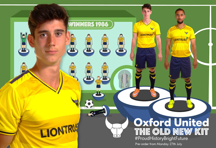
The new kit looks nice but I would love us to use the same template as the ice hockey team with the designs of the buildings in oxford etc that a very smart jersey I wish we would have something similar with the skyline of oxford on the back of the shirts be different to most football clubs and would be good talking point for leagues to follow there own unique style
on 2nd viewing its starting to grow on meEnlarged image from club's online shop:
View attachment 1552
Why thank youThat sir is a brilliantly idea
Likewise, it's actually really frustrating to look atLike it although I wish they would match up the shade of blue on the badge with the rest of the shirt (or vice versa).

Big Ron era we had the classic round neck ....based on the wolves gold n black shirts of the late 50s - mid 60sDon’t think the U’s have ever had a kit with a classic round neck design?
Prefer it to last season’s collar.