Yeah, I rate that!
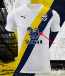
It may just be the fact I'm a graphic designer, but does anyone else get slightly frustrated with the pointless white fill between the dragon's tail and upper back? I get the idea is to allow the blue logo to stand out on the blue stripe, but they've managed to do the rest of his hindquarters with just a thin white outline, so why there? The white gap between the back legs is actually made their outlines being so close to each other, but there is plenty of room between the tail and back.
Other than that, I like it a lot. The white crest works for me, and as mentioned above, avoids the horrid blue mismatch, as well as making it stand out on the dual-coloured sash.
Does anyone know if the pinstripes are still in the crest's background? From what I can tell from these pictures, they appear to have gone? If so, I'm glad, as I never liked them.
Rant over!
View attachment 1828

